The checkout page in website navigation design in 2022

Introduction to checkout page design
The competition on the market seems to be higher than ever. With the breakthroughs in computer devices and lighting fast speed of internet connection worldwide, it became much tougher to stand out for businesses in the eCommerce industry. According to Shopify, the eCommerce market is as big as $5.55 trillion in 2022, and will only continue to grow. Markin Blog claims that there are 9.5 million websites in the United States alone!
How to make your business successful in this highly competitive environment? The answer is a thought-out design! If the survey by Blue Corona is to be believed, 48% of respondents said that design is the most important factor in the credibility of a business.
Website design is an endless topic that deserves a series of articles that will describe it properly. This time, we will focus on designing high-converting checkout pages that will ensure high revenues for your organization. If you are in the process of planning a website redesign strategy or want to create an entirely new one, this checkout page design guide, based on our expertise and practical experience, might be helpful for you. Now let’s share some tips on providing the best checkout experiences for your website!
Why eCommerce checkout pages are important?
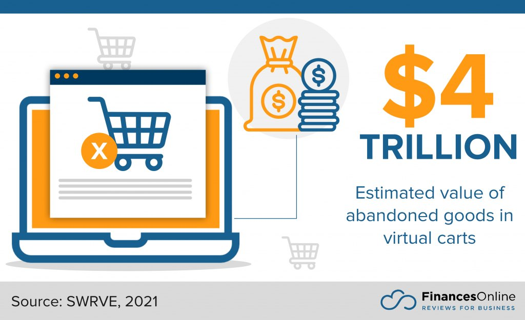
The answer to this question is fairly simple. Bad checkout designs may potentially lead to virtual shopping cart abandonment, which is a critical problem for the eCommerce industry. Shopping cart abandonment losses result in trillions of lost profits:

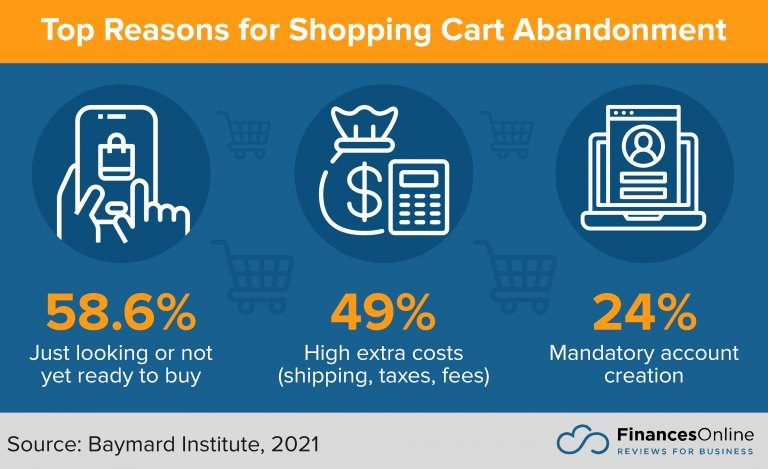
Here are the most common reasons for shopping cart abandonment, according to Finances Online:

Of course, it is impossible to prevent all possible triggers for shopping cart abandonment in your eCommerce checkout design, but you can work on things like:
- displaying all additional fees and taxes from the very start and offering total cost calculator upfront
- allowing to buy without registration
- make your website work seamlessly from a technical perspective
- add all possible payment methods that your users prefer
According to different studies, smart checkout page design can bring over 40% reduction of the cart abandonment rate, which will result in additional revenue while keeping other aspects of your business the same!
Shopping cart page design: How can you create one?
It is important to mention that there are three popular approaches that will allow you to develop your eCommerce store, including the payment checkout page and shopping cart design.
“Your website is the center of your digital eco-system, like a brick and mortar location, the experience matters once a customer enters, just as much as the perception they have of you before they walk through the door.”
― Leland Dieno
First, you can choose an existing website builder like WordPress or Wix. There are a lot of existing designs and this is the cheapest way possible to reach your goal. On the bright side is the fact that you can use it with minimal technical knowledge, or even without them at all. The biggest drawback is that you will be limited to basic features that exist on those platforms and will have a bare minimum of customization.
The second options are specialized eCommerce platforms like Shopify. You will be also limited in branding customization, but they are able to offer more industry-specific features that might be helpful.
Finally, to reach the maximum customization level and get exactly what your business needs, you can embark on creating your eCommerce store from scratch. This is the most expensive option that has additional difficulties like finding a team of proficient experts that can take on the project. However, it will offer you the freedom to build anything you want (limited only by technology and the skills of your development team).
Each approach can be better than the others depending on the situation, business size, available budget, and other factors. Here is a quick comparison:
| How to build your eCommerce website? | ||
| Approach | Advantages | Disadvantages |
| Basic website builders | – No coding experience needed- The lowest price | – Lack of functionality- Lack of customization |
| Specialized platforms | – Reasonable price- More functionality compared to basic website builders- Can be modified with a help of developers | – Limits in features you can implement |
| Custom development | – Freedom to develop anything your business needs | – Highest price- The need of proficient development team |
Few words about the importance of metrics
To make your page one of the best checkout pages that exist, you need to follow monitor key metrics that will help you to achieve your goals. Your goals can be anything from setting a specific of particular products sold for a specific period of time, to set a particular percentage of shopping cart abandoned rate reduction. Anything that works for your business!
After you set your goals, you need to measure them. Tools like Google Analytics, Glew, and Supermetrics are great choices to do just that. Knowing what you were able and not able to achieve will help you make the necessary adjustments to improve your page and increase the number of customers.
Checkout best practices: Tips to make your page stand out
Clarity
Probably the first thing you need to consider, is to check whether the information on your page is easily understandable and intuitive. Remember, that any unnecessary distraction will lower the chances for your customer to finish the check-out, and you definitely don’t need that!
Easy process
Ideally, you should create a single page checkout with minimum actions for the users. If you can’t achieve that, always look for simplifying checkout process steps, as any action the users need to take can be the reason for shopping cart abandonment.
Keep the history
For some stores, it makes sense to save the content of a shopping cart, create a purchase history and save personal data. All of these moves will help the customer during the repeated purchase of the items.
Email reminders
It will be a good idea to implement automated messages on your platform or personalized emails, considering abandoned shopping carts. There are multiple reasons for customers leaving their orders uncompleted, so just friendly reminders are able to help users finish at least some of them.
Convenient order modifications
Another important element of a well-designed eCommerce checkout flow is the easy modification of the orders. If your user needs to come back to a previous page or reload a page, it can once again lead to the abandonment of a shopping cart.
More visualization
Make sure that all of your items have high-quality and accurate images appearing on the checkout page. Usually, just text looks not as good and may be the reason for concern for the customers, and make them doubt whether they picked the right item.
Effective Call-To-Action (CTA) button
It is important to place your CTA checkout button in the most obvious and logical spot and make it noticeable visually as well. This is probably the most important element of your page and you can experiment with it by moving it to different places during the different iterations of your page. Look for analytics and put the CTA purchase button in the place where it is the most effective.
Link to FAQ section
While placing links on your checkout page is not a good idea, because customers may leave their order, providing them with the link to Frequently Asked Questions will be a great move and will give the basic instructions for the most common scenarios. Additionally, links on a checkout page may include terms and conditions, privacy, and return policies.
Provide support
If your platform allows it, it will be great to add a chat box or even an automated chatbot that will allow solving the most popular issues quickly. Ideally, the combination of both will be the most effective. Enable your chatbot to give instructions about the most common situation, however, leave the function of direct access to managers.
Instant confirmation email
You don’t want to make your customers nervous or double-check the confirmation of the order with your managers. Today, an instant confirmation email after the purchase is a standard. Make sure your email notifications work just as planned!
Input errors highlighting
Another important element of convenient web and mobile checkout UI is having any input errors highlighted instantly. Don’t make your customers input the same data all over again after they already sent a form!
Add a “thank you” message
After the purchase, you can add a message with gratitude. This message is also a great place to recommend other items in your store or put some links to your social media.
FAQ
What is an optimized checkout page?
You can consider a page optimized when the time to make a purchase, and the steps involved with this process, are reduced to the minimum. For some products, services, and scenarios it may not be simple, but you should always strive for this. Clear and logical flow is the thing you should be always working on in different iterations of your website.
How to create a better checkout experience?
First, you need to conduct an analysis of which design options are convenient for your target customers. Conduct usability testing before starting the development process, and create the design of your page based on tests. Secondly, if a few patterns get great test results you can conduct A/B tests, to determine the best option.
What is the best checkout process?
You can consider the best one, the process in which all steps are logical, the number of pages is minimal (ideally one), and there are no blockers for customers to make a purchase.


